

The screenshots below are from the home page slide show and the about page. These images express the 'feel' of the site. We wanted the site to be serious, as this is a very serious endeavor, that being the raising of these children in decidedly less than ideal circumstances. All the cliches apply here for sure, the photos of the kids show their need, but we, (the directors and myself) felt that showing you horrible pictures of some of the kids' bad neigborhoods would not be as effective as showing you what we are doing on a daily basis and how we are addressing the needs.
The presenatation below is meant to convey certain technical decisions as well as design decisions. This amounts to an abbreviated style guide that demonstrates development logic and motivation.
Please click one of the images below to navigate to those pages in a new tab. Thank you for looking, and not just at my work!
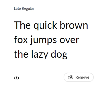
All body copy is Lato regular at the standard or default REM size of 16px.
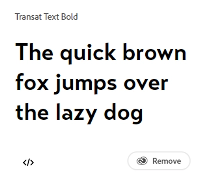
h1, h2, and h3 Header elements all use Transat Text font bold or ‘900’ weight.
#1C2322
#D4C093
#3AAEA6
#B9EACB
#603913
#A7A9AC
The colors we chose for our branding and design all come from the image below. Choosing colors from such a beautiful environment was not difficult. I was especially drawn to the 'plein' air colors from the background. They create some of the most beautiful pastels!
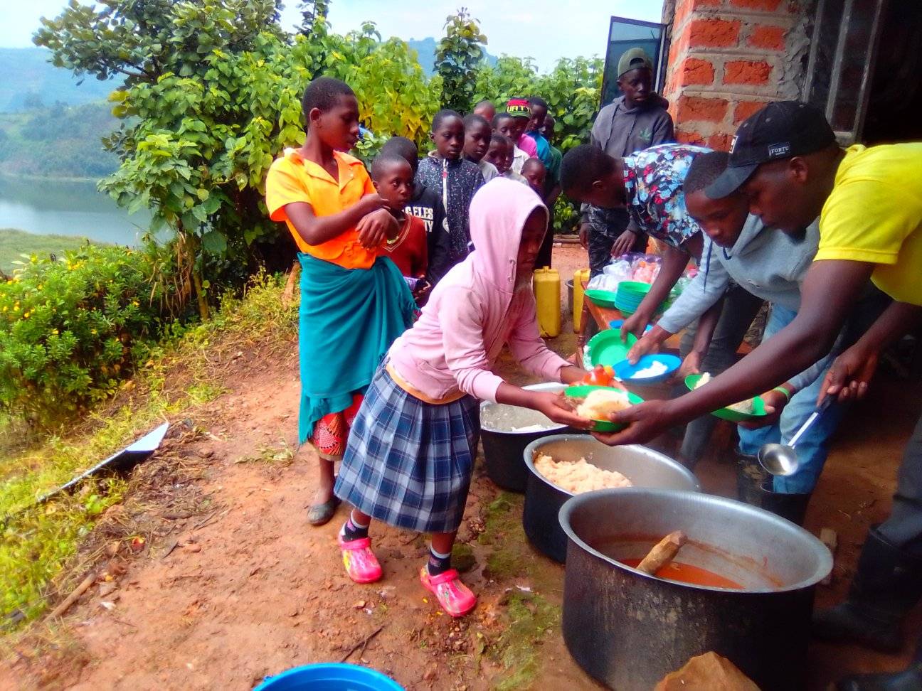
This image is from the NVCP Facebook page. It shows a beautiful scene where some of the children are being served outside within sight of the lake. This is where the money we donate to the NVCP is being spent. We struggle to provide the most basic of neccessities for these children and could really use some help.
Please accept my most sincere thanks for looking at this project. If you can find it in your heart to help, here is the link for that; Donate to NVCP